[그래프 그리는 사이트] Plot with error bar(I)

First, let's look at the resulting plot.
We need 4 variables to draw this plot.
먼저 결과물인 plot을 살펴보겠습니다.
이 plot을 그리기 위해서는 4개의 변수가 필요합니다.
Assign each of the four variables.
Think deeply about how each variable is represented graphically.
4개의 변수를 각각 지정합니다.
각 변수가 어떻게 그래프로 표현되었는지를 깊이 생각해 보시기 바랍니다.
Now let's erase the jitter. You can use delete or backspace.
이제 jitter를 지워 볼까요? delete나 backspce를 이용하면 됩니다.
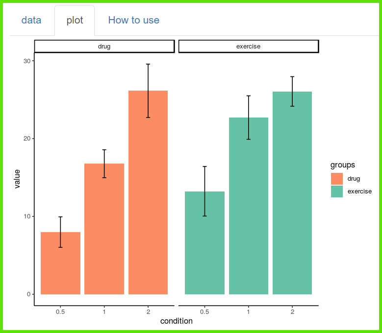
The simplest forms of bars and error bars are represented.
가장 단순한 형태인 막대와 오차막대가 표현됩니다.
Now 'Select Plot' has 'bar' selected.
'Select addition plot' has 'mean_se' selected.
Various other options are prepared in 'Select addition plot'.
지금 'Select Plot'에는 'bar'가 선택되어 있습니다.
'Select addition plot'에는 'mean_se'가 선택되어 있습니다.
그외 다양한 옵션들이 'Select addition plot'에 준비되어 있습니다.
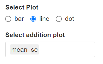
Now 'Select Plot' has 'line' selected.
'Select addition plot' has 'mean_se' selected.
You can easily create a variety of plots with a combination of these two.
지금 'Select Plot'에는 'line'가 선택되어 있습니다.
'Select addition plot'에는 'mean_se'가 선택되어 있습니다.
당신은 이 두가지 조합으로 다양한 plots을 쉽게 만들 수 있습니다.
Now you can use various embellishment options
after applying the principles mentioned above.
이제 당신은 위에 언급한 원리를 적용한 후에 다양한 꾸밈 옵션을 사용할 수 있습니다.
'plot download'를 통해서 plot size를 조절하세요.
< PDF >, < SVG > < pptx >를 클릭하면 각각의 형식으로 다운로드 받을 수 있습니다.
Adjust the plot size through 'plot download'.
You can download each format by clicking < PDF >, < SVG > < pptx >.
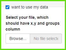
당신의 데이터를 업로드 하려면 'want to use'를 활성화한 다음, 'Browse'를 클릭하세요.
오직 csv 파일만이 사용가능합니다.
Activate 'want to use' to upload your data, then click 'Browse'.
Only csv file is available.
If you enter 0 in 'by which you will divide?'
만일 당신이 'by which you will divide?'에 0을 입력한다면,
You will get a simple plot with no facets.
당신은 facet이 없는 단순한 형태의 plot을 얻게 될 것입니다.
당신이 color와 facet에 같은 변수를 선택한다면
If you select the same variable for color and facet
You will get these charts, and sometimes you will need them.
당신은 이런 차트를 얻게 될 것이며, 때때로 이런 차트가 필요한 경우도 있습니다.