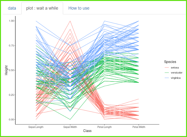
[그래프 그리는 사이트] Flow bump plot


The data is in three columns and shows the change over time.
데이터는 3열이며, 시간에 따른 변화를 보여줍니다.

If you look at the graph, you can see the trend over time at a glance.
그래프로 보면 시간에 따른 추세를 한눈에 볼 수있습니다.

So far it has been 'alphabetic', so they are placed in alphabetical order.
Now let's change it to 'ascend'.
지금까지는 'alphabetic'이었으므로 알파벳 순서로 배치되었습니다.
이제 'ascend'로 바꾸어 봅시다.

Larger numbers are placed at the top, so you can see how the ranking changes over time.
숫자가 더 큰 것이 위쪽으로 배치되므로
시간이 지남에 따라 순위가 어떻게 바뀌는지 파악할 수 있습니다.

There are a lot of fine-tuning options, but it's so intuitive
that you'll get the hang of it if you try it yourself.
In fact, you don't even need to decorate much.
세세하게 꾸밀 수 있는 다양한 옵션들이 있으나 매우 직관적이어서
직접 해 보면 금방 이해할 수 있습니다.
사실 별로 꾸밀 필요도 없긴 합니다.

'plot download'를 통해서 plot size를 조절하세요.
< PDF >, < SVG > < pptx >를 클릭하면 각각의 형식으로 다운로드 받을 수 있습니다.
Adjust the plot size through 'plot download'.
You can download each format by clicking < PDF >, < SVG > < pptx >.
당신의 데이터를 업로드 하려면 'want to use'를 활성화한 다음, 'Browse'를 클릭하세요.
오직 csv 파일만이 사용가능합니다.
Activate 'want to use' to upload your data, then click 'Browse'.
Only csv file is available.