[그래프 그리는 사이트] Pyramid Chart III


Prepare two columns of data with age and gender.
나이와 성별로 된 2열의 데이터를 준비합니다.

The Population Pyramid Chart is simply done.
Now let's modify it a bit.
인구 피라미드 차트가 간단하게 완성되었습니다.
이제 조금씩 수정해 보겠습니다.

You can change the color of the stick to your liking.
막대기의 색을 원하는대로 바꿀 수 있습니다.
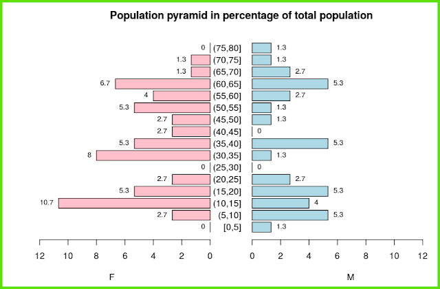

You can put labels on sticks, you can put count, but you can put %.
When inserting %, it can be based on the total male and female, or it can be expressed as a percentage for each after separating each of the male and female.
Try it for yourself and understand the meaning.
막대기에 label를 넣을 수 있는데, count를 넣기도 하지만, %를 넣을 수도 있습니다.
%를 넣을 때는 남녀 전체를 기준으로 할 수도 있고, 남자와 여자의 각각을 분리한 후 각각에 대한 %로 표현할 수도 있습니다.
직접 시행해 보면서 의미를 이해하세요.


You can change the 'bin width' if needed.
필요하다면 'bin width'를 바꿀 수 있습니다.

'plot download'를 통해서 plot size를 조절하세요.
< PDF >, < SVG > < pptx >를 클릭하면 각각의 형식으로 다운로드 받을 수 있습니다.
Adjust the plot size through 'plot download'.
You can download each format by clicking < PDF >, < SVG > < pptx >.
당신의 데이터를 업로드 하려면 'want to use'를 활성화한 다음, 'Browse'를 클릭하세요.
오직 csv 파일만이 사용가능합니다.
Activate 'want to use' to upload your data, then click 'Browse'.
Only csv file is available.
댓글 없음:
댓글 쓰기