[그래프 그리는 사이트] Wordcloud

https://drive.google.com/file/d/1dB2y9XjyTgRxp4jicVAQDSAb_IFFomzw/view?usp=sharing
https://drive.google.com/file/d/1SZXxSAo2UR-EkiqsKd72WFKc175xi3hh/view?usp=sharing

Upload the first of the two data above.
There are 2 columns. (demoFreq.csv)
위의 두 데이터 중 첫번째 것을 업로드 합니다.
2개의 열이 있습니다. (demoFreq.csv)

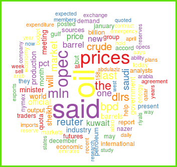
Wordcloud is created right away.
Now let's look at some options.
By default, large letters are located in the center,
and items of similar size are displayed in the same color.
Wordcloud가 바로 만들어 집니다.
이제 몇 가지 옵션을 살펴 봅시다.
디폴트로 큰 글자가 중심에 위치하고,
글자의 크기가 비슷한 것들은 같은 색으로 표현되어 있습니다.


It's now random in color and random in location.
이제는 색깔로 무작위 적이며 위치도 무작위적으로 바뀌었습니다.

If there are too many words, the readability is rather poor,
so only the top 100 words are displayed.
Rotated letters are less readable, so only 40% of the words look rotated.
You can modify this default value to your liking.
너무 많은 단어들이 있으면 오히려 가독성이 떨어 지므로,
상위 100개까지의 단어만 보이도록 설정되어 있습니다.
회전된 글자는 가독성이 떨어지므로, 40%의 단어만 회전되어 보입니다.
이 디폴트값은 여러분이 원하는대로 수정할 수 있습니다.

Various color combinations can be selected using the palette.
다양한 색들의 조합을 팔레트를 이용하여 선택할 수 있습니다.

Now let's upload the second file.(comparison_cloud.csv)
이제 두번째 파일을 업로드하겠습니다. (comparison_cloud.csv)

Now change 'select plot' to 'Grouped'.
이제 'select plot'을 'Grouped'으로 바꾸어 줍니다.

It is expressed in different colors depending on the group.
That is, it is suitable for comparing which words are most prevalent in different groups.
group에 따라 다른 색으로 표현됩니다.
즉 여러 집단에서 어떤 단어가 가장 우세한지 비교하기에 적당합니다.


If you adjust the size when downloading, the overall shape changes slightly, so it is recommended to adjust it several times to an appropriate size for yourself.
다운로드 받을 때 사이즈를 조절하면 전체적인 모양이 조금씩 달라지므로, 자신에게 적당한 크기로 적절히 수차례 조절하기를 권장합니다.
댓글 없음:
댓글 쓰기