2022년 11월 6일 일요일

[그래프 그리는 사이트] US Map

 [그래프 그리는 사이트] US Map


A simple and useful tool to map the results of US states and counties.
미국의 주와 county의 결과들을 지도로 표현할 수 있는 간단하고 유용한 도구입니다.

site : US_Map


Column 1 is the name of a US state, and columns 2 through 4 contain numeric data.
1열은 미국의 주의 이름이며 2열부터 4열까지 숫자로 된 데이터가 있습니다.


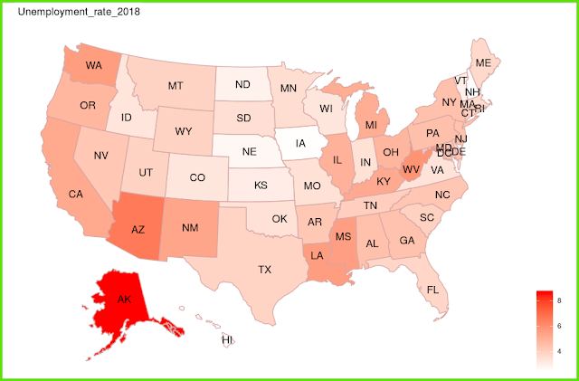
For each state, the number is expressed with the depth of color.
각 주별로 숫자를 색의 진하기로 표현해 줍니다. 


Now let's change 'data' from 'state' to 'county'.
There is data organized by each county.
이제는 'data'를 'state'에서 'county'로 바꾸어 봅시다.
각 county 별로 정리된 data가 있습니다.


It expresses the depth of color using the given information.
주어진 정보를 이용해서 색의 진하기로 표현해 줍니다.


There are several color changing options available.
몇 가지 색을 바꾸어 주는 옵션들을 활용할 수 있습니다. 

'plot download'를 통해서 plot size를 조절하세요. 
< PDF >, < SVG > < pptx >를 클릭하면 각각의 형식으로 다운로드 받을 수 있습니다.

Adjust the plot size through 'plot download'.
You can download each format by clicking < PDF >, < SVG > < pptx >.


당신의 데이터를 업로드 하려면 'want to use'를 활성화한 다음, 'Browse'를 클릭하세요.
오직 csv 파일만이 사용가능합니다.
Activate 'want to use' to upload your data, then click 'Browse'.
Only csv file is available.


[그래프 그리는 사이트] Pedigree chart

 [그래프 그리는 사이트] Pedigree chart


The example data is organized in this format.
예제 데이터는 이런 형식으로 정리되어 있습니다. 


The most basic and simple form displays 
parent-child-couple-gender using the information from columns 1 to 4.
It is very difficult and cumbersome to draw directly, but I think this alone is good enough.
가장 기본이 되는 단순한 형태는 1열부터 4열까지의 정보를 이용해서 
부모-자식-부부-성별을 표시해 줍니다.
직접 그림을 그리려면 매우 어렵고 번거로운데 이것만으로도 충분히 좋다고 생각합니다.


Now let's select '+ disease'.
이제 '+ disease'를 선택해 봅시다.


Using the information in column 5, we mark the person with the disease in black.
5열의 정보를 이용해서 병이 있는 사람을 검은색으로 표시합니다.


If you select '+ avail', the information in column 6 is displayed with a hatch.
'+ avail'을 선택하면 6열의 정보를 이용해서 빗금으로 표시해 줍니다. 

If you select '+ dead', the information in column 7 is used to display the dead.
'+ dead'을 선택하면 7열의 정보를 이용해서 사망자를 표시해 줍니다. 


'plot download'를 통해서 plot size를 조절하세요. 
< PDF >, < SVG > < pptx >를 클릭하면 각각의 형식으로 다운로드 받을 수 있습니다.

Adjust the plot size through 'plot download'.
You can download each format by clicking < PDF >, < SVG > < pptx >.


당신의 데이터를 업로드 하려면 'want to use'를 활성화한 다음, 'Browse'를 클릭하세요.
오직 csv 파일만이 사용가능합니다.
Activate 'want to use' to upload your data, then click 'Browse'.
Only csv file is available.


[그래프 그리는 사이트] Flow bump plot

 [그래프 그리는 사이트] Flow bump plot


The data is in three columns and shows the change over time.
데이터는 3열이며, 시간에 따른 변화를 보여줍니다.


If you look at the graph, you can see the trend over time at a glance.
그래프로 보면 시간에 따른 추세를 한눈에 볼 수있습니다. 


So far it has been 'alphabetic', so they are placed in alphabetical order. 
Now let's change it to 'ascend'.
지금까지는 'alphabetic'이었으므로 알파벳 순서로 배치되었습니다. 
이제 'ascend'로 바꾸어 봅시다.


Larger numbers are placed at the top, so you can see how the ranking changes over time.
숫자가 더 큰 것이 위쪽으로 배치되므로 
시간이 지남에 따라 순위가 어떻게 바뀌는지 파악할 수 있습니다. 


There are a lot of fine-tuning options, but it's so intuitive 
that you'll get the hang of it if you try it yourself.
In fact, you don't even need to decorate much.
세세하게 꾸밀 수 있는 다양한 옵션들이 있으나 매우 직관적이어서 
직접 해 보면 금방 이해할 수 있습니다. 
사실 별로 꾸밀 필요도 없긴 합니다. 

'plot download'를 통해서 plot size를 조절하세요. 
< PDF >, < SVG > < pptx >를 클릭하면 각각의 형식으로 다운로드 받을 수 있습니다.

Adjust the plot size through 'plot download'.
You can download each format by clicking < PDF >, < SVG > < pptx >.


당신의 데이터를 업로드 하려면 'want to use'를 활성화한 다음, 'Browse'를 클릭하세요.
오직 csv 파일만이 사용가능합니다.
Activate 'want to use' to upload your data, then click 'Browse'.
Only csv file is available.

[그래프 그리는 사이트] Parallel Coordinate Plot(III)

 [그래프 그리는 사이트] Parallel Coordinate Plot(III)


Up to column 4 are numeric variables, and column 5 is data with nominal variables.
4열까지는 숫자 변수이며, 5열은 명목변수인 데이터입니다.


It shows how each number varies depending on the group.
집단에 따라서 각 숫자들이 어떻게 달라지는지 보여 줍니다. 

One row is data obtained from one person, and one person's data is a straight line.
하나의 행은 한 사람에게세 얻어진 데이터이며, 한 사람의 데이터는 직선으로 이어집니다.


You must specify the number of numeric variables 
and the location of the nominal variable.
숫자 변수의 갯수와 명목변수의 위치를 지정해 주어야 합니다. 


It is recommended to adjust the 'alpha of Lines' to make it more transparent.
Enter the axis name appropriately.
'alpha of Lines'를 조절해서 좀더 투명하게 하는 것이 좋습니다. 
축 이름을 적절히 넣어 줍니다. 


Sometimes, depending on the unit, if numbers are gathered in a very small range, you can spread them apart so that they can be distinguished, try using various scales.
간혹 단위에 따라서 매우 적은 범위에 숫자가 모여 있다면 구별하기 좋도록 벌려줄 수 있는데 이 때 다양한 scale을 활용해 보세요.


It becomes much clearer to distinguish between group characteristics.
집단별 특징을 구분하기가 훨씬 명확해 집니다. 


You can make small changes using different colors and themes.
다양한 색과 테마를 이용해서 약간씩 변화를 줄 수 있습니다.

'plot download'를 통해서 plot size를 조절하세요. 
< PDF >, < SVG > < pptx >를 클릭하면 각각의 형식으로 다운로드 받을 수 있습니다.

Adjust the plot size through 'plot download'.
You can download each format by clicking < PDF >, < SVG > < pptx >.


당신의 데이터를 업로드 하려면 'want to use'를 활성화한 다음, 'Browse'를 클릭하세요.
오직 csv 파일만이 사용가능합니다.
Activate 'want to use' to upload your data, then click 'Browse'.
Only csv file is available.


[그래프 그리는 사이트] Likert Chart(3)

 [그래프 그리는 사이트] Likert Chart(3)


 site : Likert_Chart


For 6 questions, each person can answer A, B, C, D, E, or F.
Each row represents one person's answer.
6개의 설문에 대해서 각 사람은 A,B,C,D,E,F의 답을 할 수 있습니다. 
하나의 행은 한 사람의 답을 의미합니다.


The answers to all 6 questions are combined and expressed.
6개의 질문에 대해서 답을 모두 취합하여 표현해 줍니다.


The options are very simple. If 'show %' is not checked, count is displayed.
If you have a lot of questions, we recommend choosing 'flip'. 
You can adjust the number of digits after the decimal point with 'digits'.
옵션은 매우 단순합니다. 'show %'를 선택하지 않으면 count가 표시됩니다. 
질문이 많은 경우에는 'flip'을 선택하는 것이 좋겠습니다. 
소수점 이하의 자리수를 'digits'로 조절할 수 있습니다. 


Various color combinations are possible.
다양한 색의 조합이 가능합니다.

'plot download'를 통해서 plot size를 조절하세요. 
< PDF >, < SVG > < pptx >를 클릭하면 각각의 형식으로 다운로드 받을 수 있습니다.

Adjust the plot size through 'plot download'.
You can download each format by clicking < PDF >, < SVG > < pptx >.


당신의 데이터를 업로드 하려면 'want to use my data'를 활성화한 다음, 'Browse'를 클릭하세요.
오직 csv 파일만이 사용가능합니다.
Activate 'want to use my data' to upload your data, then click 'Browse'.
Only csv file is available.


[그래프 그리는 사이트] Pyramid Chart (III) 인구 피라미드 차트(3)

 [그래프 그리는 사이트] Pyramid Chart III


Prepare two columns of data with age and gender.
나이와 성별로 된 2열의 데이터를 준비합니다.


The Population Pyramid Chart is simply done.
Now let's modify it a bit.
인구 피라미드 차트가 간단하게 완성되었습니다. 
이제 조금씩 수정해 보겠습니다.


You can change the color of the stick to your liking.
막대기의 색을 원하는대로 바꿀 수 있습니다. 


You can put labels on sticks, you can put count, but you can put %.
When inserting %, it can be based on the total male and female, or it can be expressed as a percentage for each after separating each of the male and female.
Try it for yourself and understand the meaning.
막대기에 label를 넣을 수 있는데, count를 넣기도 하지만, %를 넣을 수도 있습니다.
%를 넣을 때는 남녀 전체를 기준으로 할 수도 있고, 남자와 여자의 각각을 분리한 후 각각에 대한 %로 표현할 수도 있습니다. 
직접 시행해 보면서 의미를 이해하세요. 


You can change the 'bin width' if needed.
필요하다면 'bin width'를 바꿀 수 있습니다.


'plot download'를 통해서 plot size를 조절하세요. 
< PDF >, < SVG > < pptx >를 클릭하면 각각의 형식으로 다운로드 받을 수 있습니다.

Adjust the plot size through 'plot download'.
You can download each format by clicking < PDF >, < SVG > < pptx >.


당신의 데이터를 업로드 하려면 'want to use'를 활성화한 다음, 'Browse'를 클릭하세요.
오직 csv 파일만이 사용가능합니다.
Activate 'want to use' to upload your data, then click 'Browse'.
Only csv file is available.


[그래프 그리는 사이트] 2 by 2 table, sensitivity, specificity 민감도 특이도

 [그래프 그리는 사이트] 2 by 2 table, sensitivity, specificity

site : https://tinyurl.com/2by2table  

Enter each of the 4 numbers for the 2X2 table.
2X2 table에 들어갈 4 숫자를 각각 입력합니다.


Mosaic plots proportional to numbers are created.
숫자에 비례하는 Mosaic plot이 만들어집니다.


Sensitivity and specificity, and diagnostic-related results, 
and 95% confidence intervals are presented.
민감도와 특이도 및 진단과 관련된 결과들과 95% 신뢰구간이 제시됩니다.


In addition to sensitivity and specificity, 
you can see the results of various tests available in the 2X2 table.
The results of the 2X2 table are very commonly used, 
and you can see them in detail because they are the basis for your studies.
민감도와 특이도 뿐 아니라, 
2X2 table에서 구할 수 있는 다양한 test의 결과들을 볼 수 있습니다. 
2X2 table의 결과들이 워낙 흔히 사용되며, 
공부에 기본이 되기 때문에 자세히 볼 수 있습니다.