2022년 11월 5일 토요일

[그래프 그리는 사이트] survival analysis & Kaplan Meier curves

[그래프 그리는 사이트]survival analysis & Kaplan Meier curves


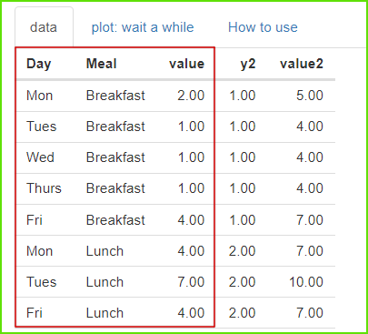
To plot Kaplan Meier curves, we need 3 columns of data as shown above.
Kaplan Meier curves를 그리기 위해서는 위에서 본 것과 같이 3열의 데이터가 필요합니다.


Common and recommended Kaplan Meier curves are drawn right away.
In particular, it is desirable to have 'Number at risk'  below the graph.

일반적이고 권장할만한 Kaplan Meier curves가 바로 그려집니다. 
특히 Number at risk가 그래프 아래에 표현되도록 하는 것이 바람직합니다.


If the graph is too complex, you can omit the 'confidence interval'.
The interval on the x-axis can also be appropriately adjusted according to the unit of time, and 'Number at risk' is automatically calculated according to the unit.
I would recommend omitting the 'p-value' unless absolutely necessary.

그래프가 너무 복잡한 경우에는 'confidence interval'를 생략할수도 있습니다.
x축의 간격도 time의 단위에 따라 적절히 조절할 수 있고 'Number at risk'도 그 단위에 따라 자동으로 계산됩니다.
'p-value'는 꼭 필요하지 않다면 빼도록 저는 추천하겠습니다.


Sometimes showing a horizontal line showing 50% and its vertical line 
can be helpful for understanding.
You can also plot other related graphs, such as 'cumulative events'.

간혹 50%를 보여주는 수평선과 그의 수직선을 보여주는 것이 
이해에 도움이 될 수 있습니다. 
'cumulative events' 등의 연관된 다른 그래프도 그릴 수 있습니다.


There are several options for calculating the CI of the survival table, 
and beginners can choose the default value.

survival table의 CI를 계산해주는 몇 가지 옵션이 있으며 
초보자들은 디폴트값을 선택하면 되겠습니다.


There are several ways to calculate the p-value, 
and in most cases a beginner can choose the default value.
p값을 계산하는 몇 가지 방법이 존재하며 
보통의 경우에 초보자는 디폴트값을 선택하면 됩니다. 


Summary statistics are also textually available.
요약 통계량도 문자로 확인 가능합니다.


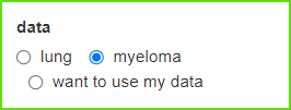
Let's take the second example data, myeloma.
두번째 예제 데이터인 myeloma를 선택해 봅시다.


Since there are 3 groups, 3 survival curves are shown.
3개의 집단이므로 3개의 생존곡선이 보여집니다.


Since it is a comparison of three or more groups, a post-hoc test is required, 
and an appropriate p-value adjustiment can be selected for this.
3집단 이상의 비교이므로 사후 검정이 필요하며, 
이에 적절한 p값의 보정을 선택할 수 있습니다.


As you can see in the picture again, 
there is no significant difference between 'Obs' and 'Lev'.
그림에서 본 것과 같이 'Obs'와 'Lev'는 큰 차이가 없음을 다시 볼 수 있습니다.


Adjust the plot size through 'plot download'.
You can download it in <PDF> or other formats.

'plot download'를 통해서 plot size를 조절하세요. 
< PDF > 또는 다른 형식으로 다운로드 받을 수 있습니다.


Activate 'want to use' to upload your data, then click 'Browse'.
Only csv file is available.
당신의 데이터를 업로드 하려면 'want to use'를 활성화한 다음, 'Browse'를 클릭하세요.
오직 csv 파일만이 사용가능합니다.


2022년 11월 4일 금요일

[그래프 그리는 사이트]Series of Densitogram

[그래프 그리는 사이트]Series of Densitogram


https://drive.google.com/file/d/1YSfzM5Ib8f2q7_zTk3d1edn087JWN4l3/view?usp=sharing


If you upload a file downloaded from Google Drive and look at it, it has 4 columns.

구글 드라이브에서 다운로드 받은 파일을 업로드해서 살펴보면 4개의 열로 되어 있습니다.


A plot like the one above is created without any special options.

The distribution by year is shown in turn to see if there is a difference in the distribution according to men and women, so it is good to judge the difference over time.

특별한 옵션없이 바로 위와같은 plot이 만들어 집니다. 

남녀에 따른 분포의 차이가 있는지 년도별 분포가 차례로 보이므로
시간에 따른 차이를 판단하기 좋습니다.


If you change the scale, the height of the mountain increases little by little, and the upper and lower mountains slightly overlap.

You just have to watch and adjust accordingly.

scale을 바꾸어 주면 산의 높이가 조금씩 커지면서 위 아래 산들이 약간 겹치게 됩니다. 

본인이 보면서 적절히 조절하면 됩니다.


You can change it by choosing a variety of colors and themes.

다양한 색과 테마를 선택해서 변화를 줄 수 있습니다.

'plot download'를 통해서 plot size를 조절하세요. 
< PDF >, < SVG > < pptx >를 클릭하면 각각의 형식으로 다운로드 받을 수 있습니다.

Adjust the plot size through 'plot download'.
You can download each format by clicking < PDF >, < SVG > < pptx >.


[그래프 그리는 사이트] Plot with Significance(p-values)

[그래프 그리는 사이트]Plot with Significance(p-values)


In the example data, column 1 is a group variable, and column 2 is a numeric variable.
예제 데이터의 1열은 집단변수이며, 2열은 숫자 변수 입니다. 


The measured values ​​of several groups are displayed on the graph, 
and the p-value is expressed by pairing two groups at the same time.
여러 집단의 측정값들이 그래프에 표현되어 있고 
동시에 두 집단씩 짝을 지어 p값을 표현해 줍니다. 


This option specifies where the three p-values ​​are located.
Groups 1-2, 3-4, and 6-7 are compared.
Each location is also specified.
3개의 p값이 어떤 위치에 있을지 지정해 주는 옵션입니다. 
1-2집단, 3-4집단, 6-7집단이 비교됩니다.
각각의 위치도 지정됩니다. 


For statistical tests, t-test, which is a parametric test, 
and its non-parametric test (wilcox.test) are performed.
You can draw violin plots, boxplots and jitter plots, 
and you can draw each in black and white and color.
통계적  test는 모수검정인 t-test와 이것의 비모수 test(wilcox.test)를 시행해 줍니다. 
violin plot와 boxplot와 jitter plot를 그릴 수 있으며 각각을 흑백과 color로 그릴 수 있습니다.


'plot download'를 통해서 plot size를 조절하세요. 
< PDF >, < SVG > < pptx >를 클릭하면 각각의 형식으로 다운로드 받을 수 있습니다.

Adjust the plot size through 'plot download'.
You can download each format by clicking < PDF >, < SVG > < pptx >.


[그래프 그리는 사이트] Spaghetti Plot for longitudial data

[그래프 그리는 사이트] Spaghetti Plot for longitudial data


https://tinyurl.com/Spaghetti-Plot-for-longitudial


https://drive.google.com/file/d/1NJJmIqhzLfUrCQu7BR8x3Bhiv74XnsmE/view?usp=sharing


Download and upload the above file (GEE_Plot2.csv in Google Drive).
위의 파일(구글드라이브에 있는 GEE_Plot2.csv)을 다운로드 받아 업로드 합니다. 


Specify column 1 for id, column 3 for time, and column 6 for value.

id에 해당하는 1열과 시간에 해당하는 3열과 값에 해당하는 6열을 지정해 줍니다.

'groups' and 'subgroups' are determined by the names of the variables.

'groups' 와 'subgroups'는 변수의 이름으로 결정됩니다.


The current variable settings are as in the picture above, 

and you can change them to something else as needed.

현재 변수 설정은 위의 그림과 같으며 필요에 따라 다른 것으로 바꿀 수 있습니다.


This is the first plot you will see.

The change in each person's value is represented by a single line.

먼저 보게되는 plot입니다. 

각 사람의 값의 변화가 하나의 선으로 표현됩니다.


Four options are available. If you select 'show facet by groups'

4개의 옵션이 제공됩니다. 'show facet by groups'를 선택한다면


Divided by 'groups', we get the result placed left and right.

'groups'에 의해 나누어져서 좌우에 배치된 결과물을 얻게 됩니다.


 If you select 'show facet by subgroups'

Divided by 'groups'and 'subgroups', we get the result.

'show facet by subgroups'를 선택한다면

'groups'과 'subgroups'에 의해 나누어진 결과물을 얻게 됩니다.


If you choose 'colorful', you will get a result expressed in a different color for each person.

'colorful'을 선택한다면 각 사람마다 다른 색으로 표현된 결과물을 얻게 됩니다.


Now let's place 4 columns (age) on the x-axis. 

The start and end points of each line are expressed differently.

이제 x축에 4열(age)을 배치해 봅시다. 

각 line의 시작점고 끝점이 제각각 다르게 표현됩니다.


'plot download'를 통해서 plot size를 조절하세요. 
< PDF >, < SVG > < pptx >를 클릭하면 각각의 형식으로 다운로드 받을 수 있습니다.

Adjust the plot size through 'plot download'.
You can download each format by clicking < PDF >, < SVG > < pptx >.


[그래프 그리는 사이트] Matrix Bubble Plot

[그래프 그리는 사이트] Matrix Bubble Plot


Specify two nominal variables and one numeric variable. 
The numeric variable determines the size of the bubble.
두 개의 명목변수와 1개의 숫자변수를 지정합니다. 
숫자 변수는 거품의 크기를 결정합니다.


You can easily create a Matrix Bubble Plot. 
Note that the horizontal and vertical axes are arranged in alphabetical order. 
If there is a desired turn, you need to do some preliminary work, 
such as writing a number in front of a letter.
Matrix Bubble Plot를 쉽게 만들 수 있습니다. 
가로축과 세로축은 알파벳 순서에 따라 배치됨을 주의 합니다. 
원하는 차례가 있다면 문자앞에 숫자를 적는 등의 사전 작업이 필요합니다.


You can easily change the font size, shape color and shape.
폰트의 크기, 도형의 색과 모양을 쉽게 바꿀 수 있습니다.


It is recommended that you learn by doing it yourself.
본인이 직접 실행해 보면서 익히는 것이 좋습니다.


'plot download'를 통해서 plot size를 조절하세요. 
< PDF >, < SVG > < pptx >를 클릭하면 각각의 형식으로 다운로드 받을 수 있습니다.

Adjust the plot size through 'plot download'.
You can download each format by clicking < PDF >, < SVG > < pptx >.


당신의 데이터를 업로드 하려면 'want to use'를 활성화한 다음, 'Browse'를 클릭하세요.
오직 csv 파일만이 사용가능합니다.
Activate 'want to use' to upload your data, then click 'Browse'.
Only csv file is available.