[Daddy's R Data Visualization] : USA Bubble Map
example

step1: visit here
https://play71.shinyapps.io/US_Bubble_Map/or
https://tinyurl.com/US-Bubble-Map
actually, they are the same
step2: see the data structure

step3: get the plot and edit
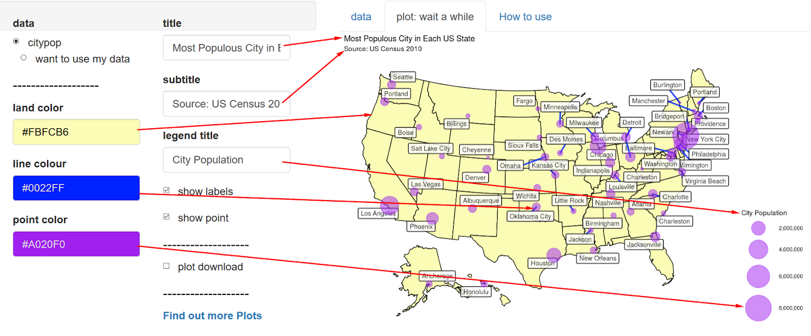
you can select 3 colors and 3 texts, as you want

While resizing it, if you upsize you can get smaller texts.

step 4: upload your data

Prepare your data like example data in EXCEL.
Save as an CSV file.
Click "want to use my data" and upload.
https://statistics4everyone.blogspot.com/2019/12/daddys-r-data-visualization-usa-bubble.html
답글삭제Thanks again for the article post.Really thank you! Fantastic.
답글삭제Visualization is key in representing data. It makes your data stand out, influences your audience, and helps make important business decisions. Data visualization is a visual art form that represents facts and statistics in a way that captures the audience's attention.
Very Nice Blog and the best explanation of uses tableau, This blog will help students a lot. I am glad to announce that ducat is offering best expert training for Tableau and guaranteed placement assistance for students to help the grow in your career
답글삭제
답글삭제I am really very happy to visit your blog. Directly I am found which I truly need. please visit our website for more information
Data Visualization Service