2020년 1월 2일 목요일
아빠가 들려주는 [통계] 연속변수 나누기, 통계적 의미있는 구간으로..
아빠가 들려주는 [통계] 연속변수 나누기, 통계적 의미있는 구간으로..
https://tinyurl.com/Significant-Cut
아빠가 들려주는 [통계/의학/연구] 어깨 견봉하 성형술 필요한가? a RCT in Lancet (2018)
참고한 논문은
Lancet. 2018 Jan 27;391(10118):329-338. doi: 10.1016/S0140-6736(17)32457-1. Epub 2017 Nov 20.
Arthroscopic subacromial decompression for subacromial shoulder pain (CSAW): a multicentre, pragmatic, parallel group, placebo-controlled, three-group, randomised surgical trial.
입니다. 직접 읽어 보셔도 좋겠습니다.
2020년 1월 1일 수요일
아빠가 들려주는 [데이터 시각화] Alluvial Diagrams
아빠가
들려주는 [데이터
시각화] Alluvial
Diagrams
들려주는 [데이터
시각화] Alluvial
Diagrams
변수가 많을 때, 연속변수와 명목변수가 섞여 있을 때 효과적으로 표현하기가 어렵죠.
완벽하진 않지만 이런 경우가 가장 쉽게 사용할 수 있으면서도
아주 예쁜 plot입니다.
이미 1권 2권에서도 비슷한 것들을 소개한 바 있지만,
이건 조금 다른 면이 있어서 어떤 점이 다른지 이해하면 좋겠습니다.
아빠가 들려주는 [데이터 시각화] Likert Chart
아빠가
들려주는 [데이터
시각화]Likert
Chart
들려주는 [데이터
시각화]Likert
Chart
설문조사 등에서 많이 사용되고,
신문에서도 가끔 보는 차트죠?
예쁠 뿐 아니라, 편리합니다.2019년 12월 27일 금요일
[Daddy's R Data Visualization] : USA Map
[Daddy's R Data Visualization] : USA Map
or
https://tinyurl.com/US-ezMap

'state' and others(with numbers)
'state' has the name of USA states
 set the colors for high value and low value,
the colors for the territories and labels.
you can select the data column to show.
if you deactivate the "show labels', you can get the cleaner one.

this data have 'fips' and others.

you can see the plot.
you can download the plot as a PDF or a PPTX.
You can edit more with the PPTX
 edit your data in EXCEL and save as "CSV".
your data should have at least one of 'state' and 'state'.
step 1: visit
https://play70.shinyapps.io/US_Map/or
https://tinyurl.com/US-ezMap
step 2 : see the example data

'state' and others(with numbers)
'state' has the name of USA states
step 3: get the plot and edit

the colors for the territories and labels.
you can select the data column to show.
if you deactivate the "show labels', you can get the cleaner one.
step 4 : another data

this data have 'fips' and others.
step 5 : get the plot and edit more

you can see the plot.
you can download the plot as a PDF or a PPTX.
You can edit more with the PPTX
step 6 : your data

your data should have at least one of 'state' and 'state'.
[Daddy's R Data Visualization] : USA Bubble Map
[Daddy's R Data Visualization] : USA Bubble Map
example

step1: visit here
https://play71.shinyapps.io/US_Bubble_Map/or
https://tinyurl.com/US-Bubble-Map
actually, they are the same
step2: see the data structure

step3: get the plot and edit
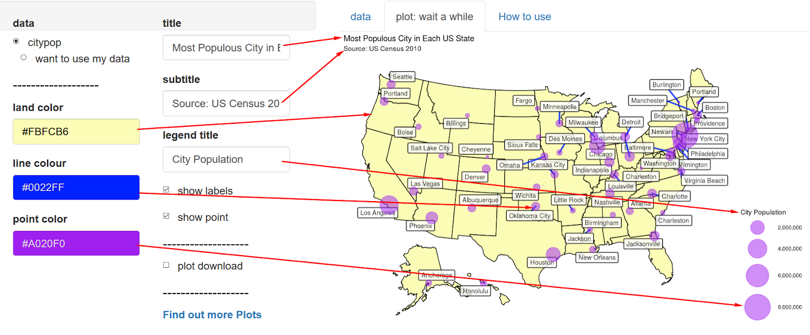
you can select 3 colors and 3 texts, as you want

While resizing it, if you upsize you can get smaller texts.

step 4: upload your data

Prepare your data like example data in EXCEL.
Save as an CSV file.
Click "want to use my data" and upload.
피드 구독하기:
글 (Atom)